Vouch4U: Slashing Cash Reimbursement Time by 64%
Reducing cash reimbursement delays by replacing their manual, paper-based voucher system with an automated solution at Kaveri Garage.
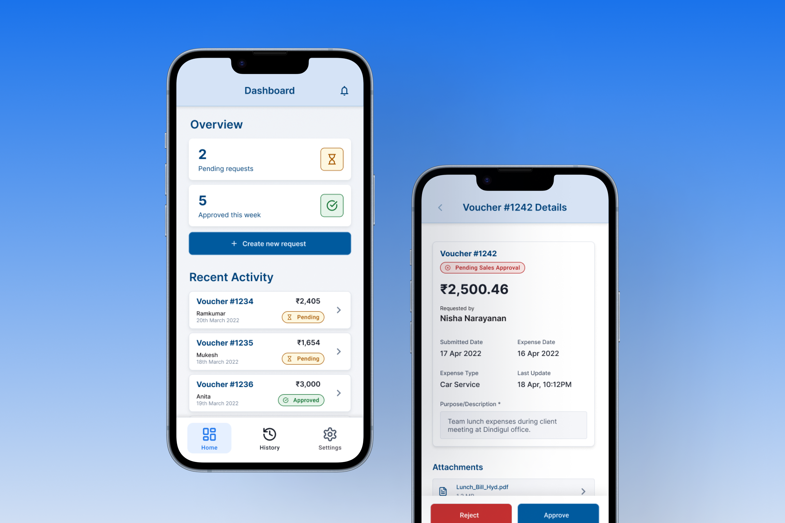
As the Product Designer, I led the design for this digital transformation. The initial MVP successfully digitized the core workflow, achieving a 64% reduction in average reimbursement time. Subsequent iterations focused on optimizing the user experience based on feedback and usability testing.
The Problem: Bottlenecks & Frustration
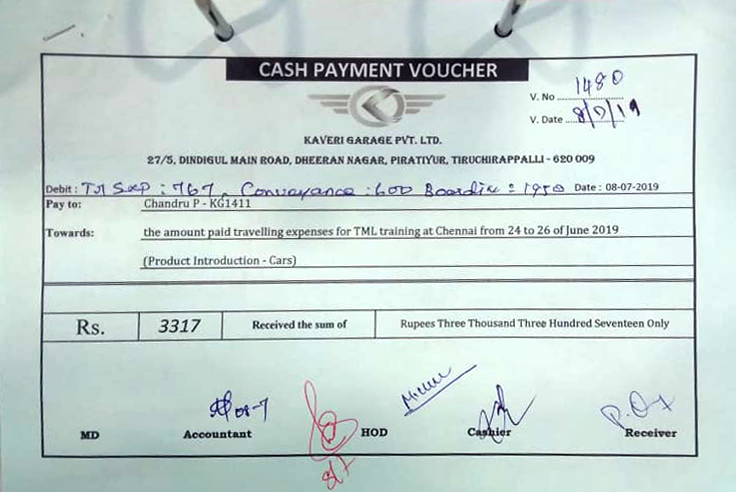
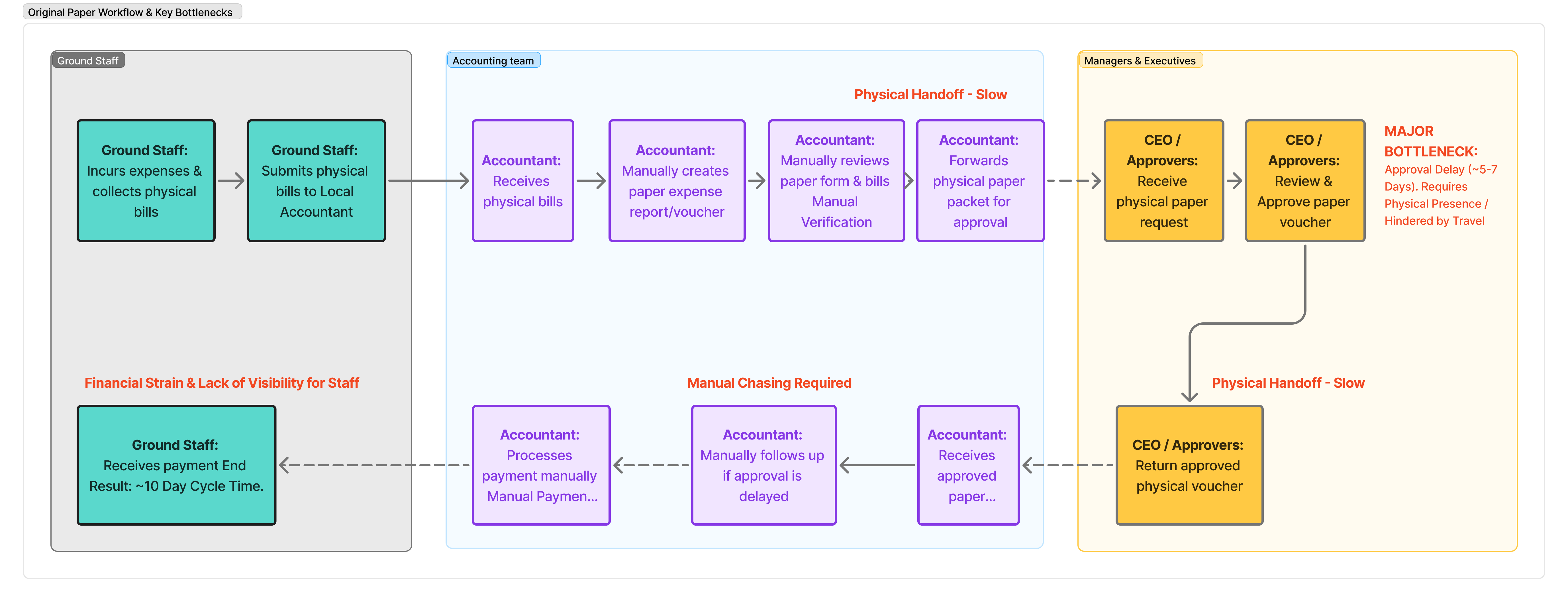
At Kaveri Garage, a busy TATA Motors dealership, a manual, paper-based voucher system created significant operational friction. Employees faced up to 10-day waits, causing financial strain, while managers and accountants battled inefficiency. This bottleneck hampered productivity and morale.
The multi-day delay wasn't just slow; it directly impacted employees' finances , especially lower-income staff. It also translated to hidden costs for the business: hours wasted by accountants tracking paper, managers bogged down in approvals upon return from travel, and frequent interruptions due to a lack of transparency in the process.
Who Was Affected?
| Attribute | Ground Staff (e.g., Drivers) | Accountant (Office-based) | Manager / CEO (Often Traveling) |
|---|---|---|---|
| Est. Age Range | 25-50 | 30-55 | 40-60+ |
| Salary & Context | Lower income; out-of-pocket expenses significant. | Mid-level; responsible for accuracy & process adherence. | Higher income; time-constrained, needs efficiency. |
| Pain Point/Need | Financial Strain: Long waits critical. Lack of status updates caused anxiety. | Inefficient Manual Work: Time consumed tracking paper, chasing signatures, reconciliation, fielding inquiries. | Approval Backlogs & Follow-up Difficulty: Travel led to piled-up approvals. Difficulty tracking status easily. |
| Quote/Sentiment | "Where's my money?" | "...need a better way to screen, track, manage..." | "Managing approvals takes too much time..." |
Goals & Constraints
Our primary goal was clear: drastically cut reimbursement time (target: < 3 days) and significantly improve transparency for all stakeholders. We operated under constraints including a tight 8-week MVP timeline and varying levels of user tech literacy.
The initial focus was strategically placed on digitizing the core approval process, accepting that full paper elimination (like OCR) would be a later phase.
Research: Observing the Reality
To deeply understand the problem, we combined stakeholder interviews (Accountants, Managers, sample Staff) with contextual inquiry—observing the actual paper-based workflow in action. This ethnographic research revealed friction points missed in interviews, such as the difficulty tracking down traveling managers for signatures and the frequent, disruptive ad-hoc status checks via phone calls.
Key Insights
- Approvers needed a fast, efficient way to approve requests on mobile, especially while traveling.
- Accountants required a centralized digital system for initiating requests, tracking progress, and reducing manual data entry/follow-up.
- All users, especially ground staff, needed transparency on request status and faster cash release.
- Insight → Strategy: The most critical bottleneck wasn't just tracking, but the delay in cash release. This led to the strategic decision to implement provisional digital approvals in the MVP, allowing payments to be processed faster based on digital sign-offs, with physical reconciliation happening subsequently.
Strategy: Focus and Trade-offs
Our strategy centered on delivering maximum impact within the MVP constraints. We prioritized features addressing the core approval bottleneck and enhancing transparency.
- Focused On: The core approval workflow targeting accountants (for initiation & tracking) and managers (for approvals) as primary MVP users, as they controlled the main bottlenecks.
- Key Design Principle: Opted for clear, scannable UI elements like summary cards and status pills over dense tables, prioritizing mobile usability for managers.
- Accepted Trade-off: Implemented provisional approvals to dramatically speed up payment release, acknowledging that formal physical reconciliation would still occur later, balancing speed with necessary financial controls.
- Deferred (for MVP): Features like direct bank integration, Optical Character Recognition (OCR) for receipts, and a dedicated UI for employees to submit requests were deferred.
Design: Clarity and Efficiency
Following the initial MVP launch which proved the concept and delivered significant time savings, we further refined the user experience and visual design based on feedback. The design focused on addressing the core pain points through clear information architecture and consistent UI patterns, utilizing a foundational design system. Key solutions included:
Visualized Workflow & Mobile Actions
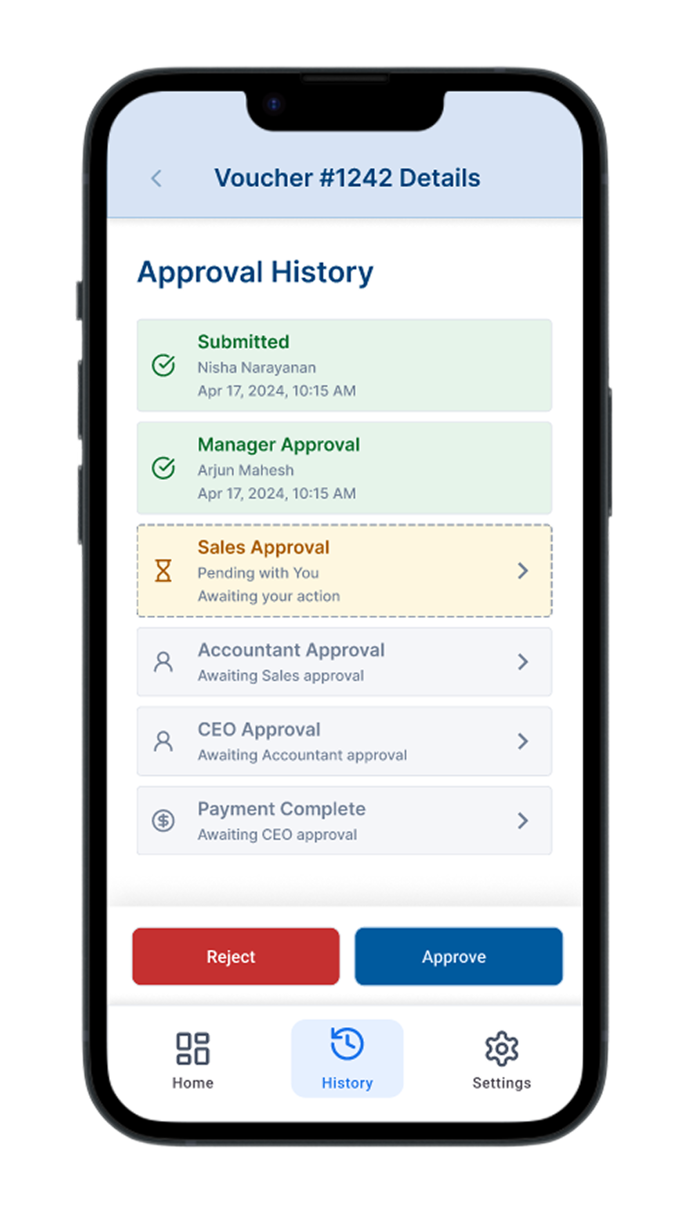
To clarify the multi-step process and combat manager approval delays, we designed two key elements for the Request Details screen:
- Card-Based Approval Steps: Uses distinct iconography ( Completed, Pending, Future) and color-coding to intuitively show progress and bottlenecks.
- Sticky Footer Action Bar: Appears only when action is needed by the current user. By ensuring Approve/Reject buttons are unmissable on mobile, directly addressing a key bottleneck identified in research.
Clear History & Filtering
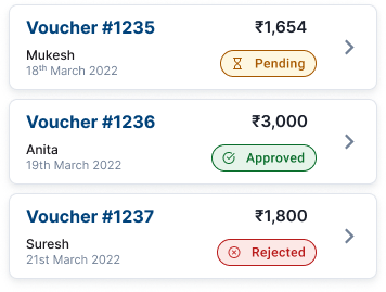
To provide transparency and efficient tracking for accountants, the History screen displays requests chronologically with consistent, color-coded status pills (Pending, Approved, Rejected) for unambiguous, at-a-glance feedback.
Robust filtering options accessible via allow users to easily find specific requests by status, date range, amount, or requester, reducing manual searching time.
Structured Request Details
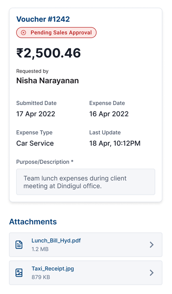
To ensure approvers quickly grasp essential information, the Request Details screen features a prominent Header Card consolidating critical data: Voucher ID, Current Status, Amount, and Requester. Below, secondary details (dates, expense type, description, attachments) are organized clearly, improving scannability compared to dense paper forms and reducing friction during approvals.
Foundational Design System
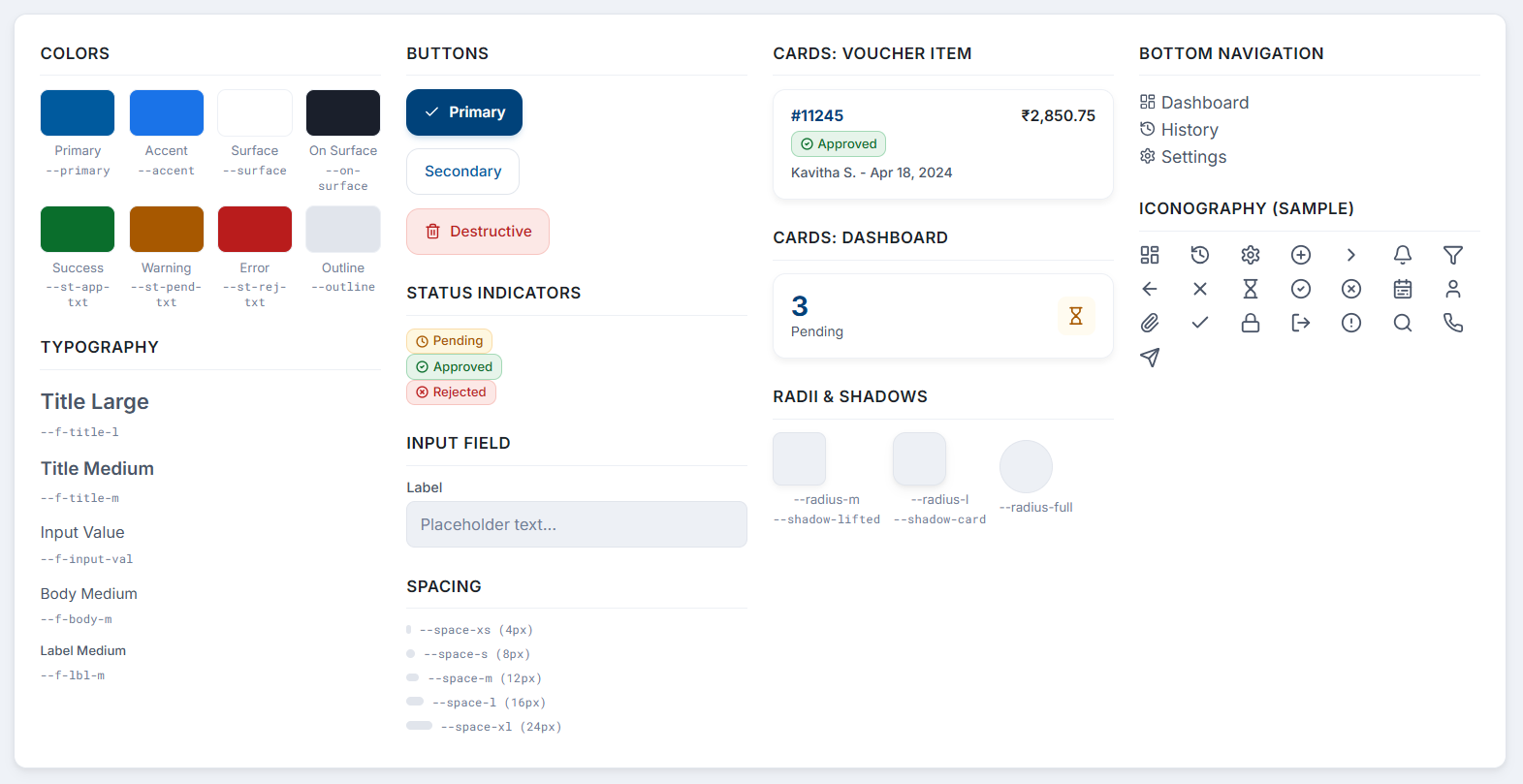
To ensure visual consistency and streamline development during the refinement phase, we established a foundational design system in Figma. This library of core styles (colors, typography, spacing) and reusable components (buttons, cards, status indicators, form elements) enabled efficient iteration based on feedback and ensured a cohesive user experience across the application. This systematic approach greatly facilitated the post-MVP refinement process.
Validation: Feedback Loops
While the MVP timeline limited formal usability testing initially, validation was continuous through:
- Informal Walkthroughs: Regular Figma prototype reviews with the PM and Engineer caught logical issues early.
- Targeted Stakeholder Feedback: Demonstrations with the CEO and Head Accountant ensured alignment. For example, feedback on the initial approval step visualization led to refining iconography (switching to clearer icons like for pending) and adding explicit secondary text (e.g., "Awaiting your action") for pending steps.
- Post-MVP Observation: Monitoring usage and gathering qualitative feedback informed the UI refinements shown in the design section.
Interactive Prototype
Impact: Measurable Results
The Vouch4U initiative successfully digitized and streamlined the complex voucher approval workflow, delivering significant outcomes:
- Achieved a 64% reduction in average end-to-end reimbursement time shortly after the MVP launch (down from ~10 days to ~3 days).
- Significantly improved satisfaction among managers and accountants, who praised the increased speed and clarity.
- Accountants reported substantial time savings, estimating several hours saved weekly per person due to eliminating manual tracking and follow-ups.
- Drastically reduced paper shuffling for approvals, streamlining the core administrative bottleneck.
- Enhanced overall usability and efficiency through iterative UI refinements based on user feedback.
Business Outcome: The project resulted in increased operational efficiency, improved employee morale (particularly for staff reliant on timely reimbursements), and minimized process friction within the finance and management teams.
Reflections
- Contextual Inquiry is Non-Negotiable: Observing the real-world process was invaluable; interviews alone wouldn't have captured the full extent of the friction.
- MVP Strategy Accelerates Value: Focusing on the core bottleneck (approvals) allowed us to deliver significant impact quickly, proving the concept's value.
- Iteration Bridges the Gap: While the MVP solved the main problem, addressing usability feedback through iterative refinement (leading to the polished UI shown) was crucial for long-term adoption and satisfaction.
- Systematic Design Enables Agility: Having a foundational design system greatly facilitated the post-MVP refinement process, ensuring consistency and speeding up development.
What I'd Do Differently (Next Time):
- Integrate brief, targeted usability testing even within a tight MVP schedule, focusing on the most critical user flows.
- Establish clearer channels for ongoing user feedback collection immediately post-launch to inform the iteration backlog more proactively.
- Explore adding simple view-only progress tracking for staff earlier in the roadmap to directly address their anxiety about status updates, even if full submission capabilities are deferred.
Vouch4U demonstrates how a user-centered design approach, combining focused MVP delivery with iterative refinement and systematic design practices, can effectively tackle complex operational challenges and deliver substantial, measurable business and user value.
