Architecting P&I's Virtual Event Platform
Navigating the Shift to Digital Engagement: Designing a user-centric virtual event platform focused on usability and interaction.
The Catalyst & Opportunity
The global pandemic brought physical events to a standstill, presenting an existential threat to P&I (Pavilions & Interiors), a leader in exhibition design. Initial stakeholder workshops confirmed the urgent need for transformation. Existing virtual platforms were often plagued by poor user experiences – clunky interfaces, technical issues, and a lack of engagement leading to "Zoom fatigue." This wasn't just an inconvenience; it was a critical business challenge requiring immediate adaptation.
As the Lead Product Designer, I spearheaded the end-to-end design process over an intense 8-week period. Collaborating closely with Product Management and Engineering, we aimed to move beyond temporary fixes. Our goal was to deliver a user-informed, high-fidelity prototype that could serve as the blueprint for a resilient, engaging digital offering – one that addressed the core failures we saw across the existing market.
The Problem: Frustration Meets Business Risk
The shortcomings of competitor platforms ran deep. Remote user interviews painted a clear picture of widespread frustration among both attendees and exhibitors. Key pain points included:
- Confusing navigation and feeling lost within platforms.
- Passive content consumption leading to disengagement ("Zoom fatigue").
- Ineffective or artificial-feeling networking tools.
- Technical glitches, unstable connections, and poor streaming quality.
- Difficulty for exhibitors to showcase products effectively and capture leads.
For P&I, relying on these subpar tools wasn't sustainable. We needed to bridge the gap between the value of physical events and the realities of a digital-first world.
Goals & Constraints: Focus Under Pressure
Our primary goal was to deliver an MVP design within the 8-week timeframe that prioritized key areas:
- Deliver a Superior Attendee Experience: Knowing this drives overall event success.
- Ensure Intuitive Navigation: Address the common 'getting lost' problem.
- Boost Engagement: Move beyond passive viewing towards interaction.
- Prioritize Reliability & Accessibility: Build trust and reach a wider audience.
We navigated constraints like the fully remote work setup and the reliance on qualitative feedback loops for validation due to time limitations.
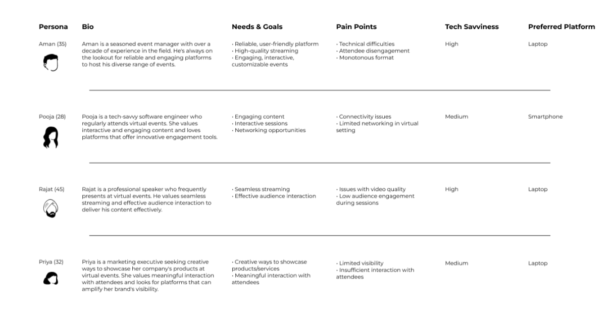
Understanding the Users
To ensure our design decisions were firmly grounded in user needs, I synthesized our interview findings and competitive analysis into key User Personas. These represented the diverse groups we needed to serve – from event managers needing reliability (like Aman) to tech-savvy attendees wanting interaction (like Pooja) and presenters requiring seamless streaming (like Rajat). Capturing their distinct goals and pain points was crucial for maintaining focus.
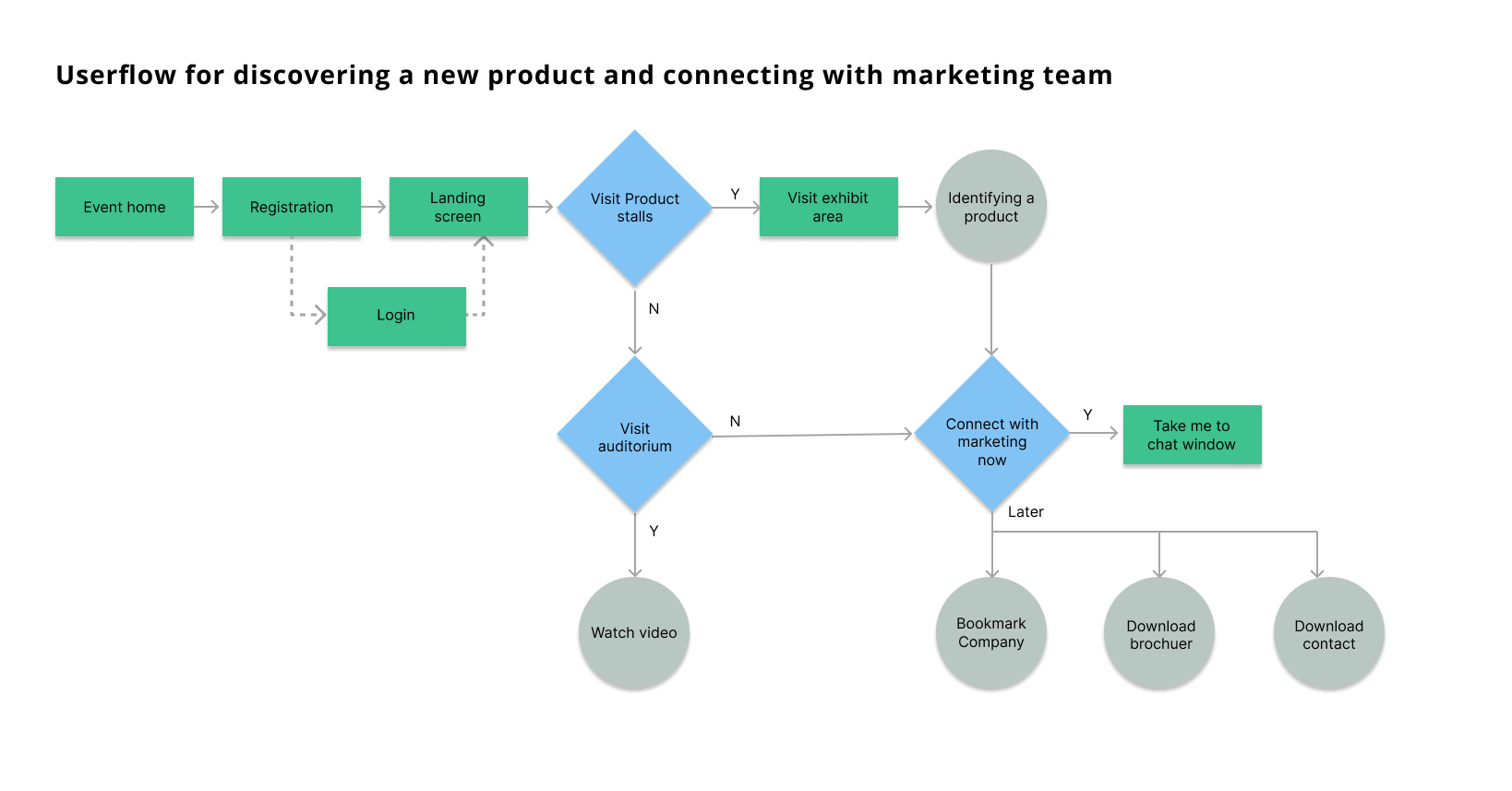
Defining the Structure
To combat the navigation chaos prevalent elsewhere and organize the platform's features logically, I developed a clear Information Architecture (Site Map). This served as the blueprint for the platform's structure, ensuring users could easily understand and navigate the different event areas accessible from the central Lobby.
Core Principles Guiding the Design
Based on this foundational research and structural planning, we established four core UX principles:
- Effortless Navigation: Make finding information intuitive and predictable.
- Active Engagement: Encourage participation and connection.
- Performance & Accessibility First: Ensure a smooth, inclusive experience.
- Clarity Builds Trust: Provide clear information and consistent interactions.
Designing the Experience: Key Solutions and Rationale
These principles translated directly into the platform's design, explored through sketches and wireframes before being built out in Figma using IBM's Carbon Design System. We focused on addressing the most critical user pain points:
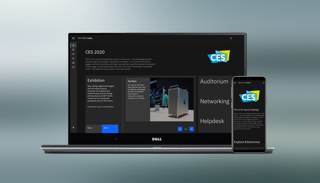
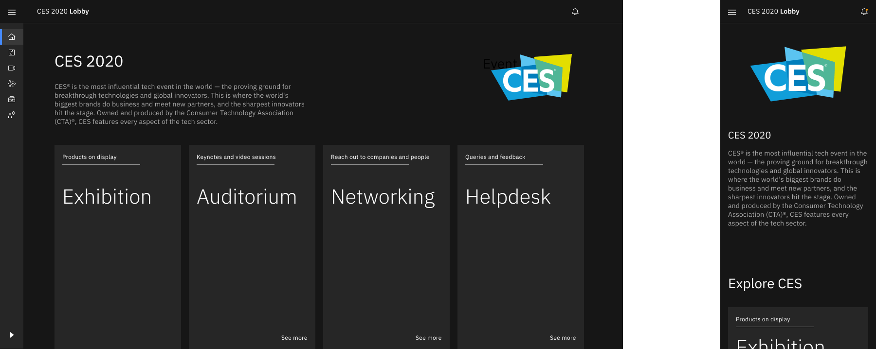
1. Intuitive Lobby & Navigation
To eliminate the feeling of being lost, we designed a clear, card-based Lobby as the central hub, coupled with persistent top-level navigation. We strategically opted for a 2D web interface over potentially complex 3D environments to prioritize accessibility, performance, and familiar web patterns – a trade-off validated by positive user feedback on clarity during prototype walkthroughs.
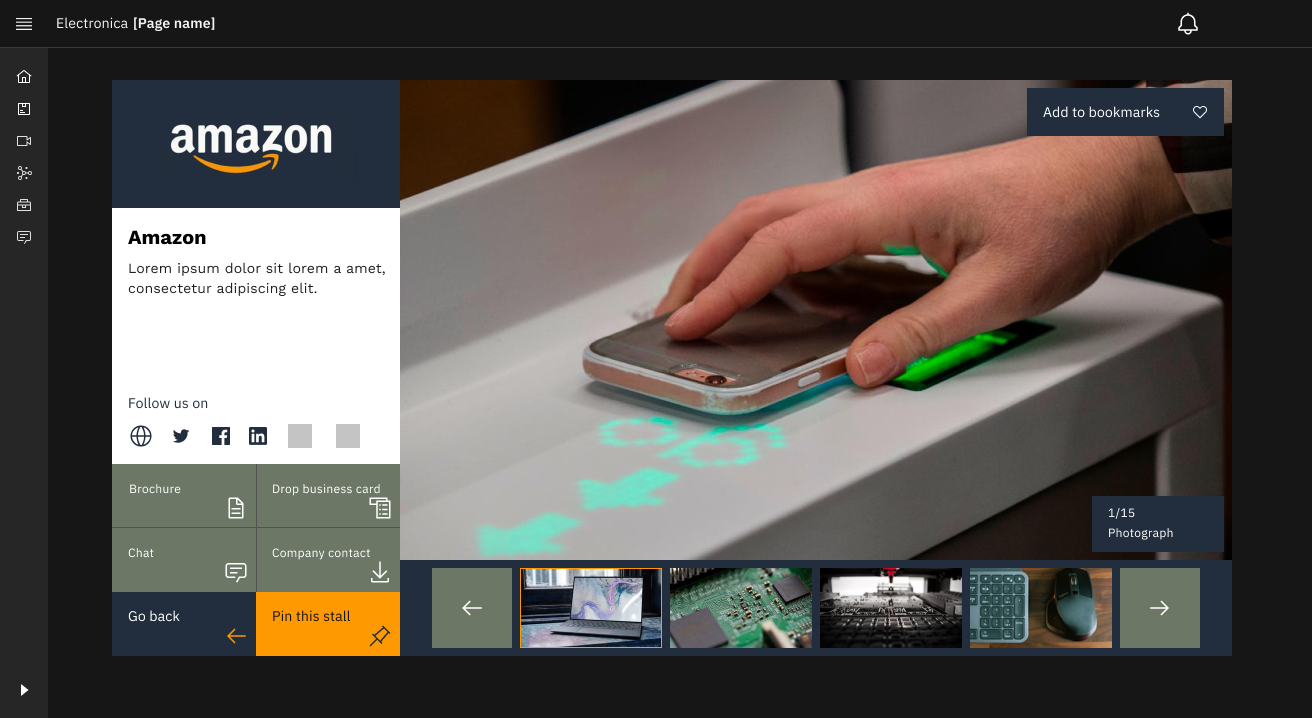
2. Engaging Exhibitor Booths
To help exhibitors connect and give attendees more ways to interact, Booth pages featured a clear information hierarchy and standardized, prominent Call-to-Action buttons (Chat, Download, Bookmark) using accessible Carbon components. When initial walkthroughs showed some user hesitation around these CTAs, we directly iterated on their visual prominence and placement, resulting in users more readily identifying interaction options in subsequent feedback sessions.
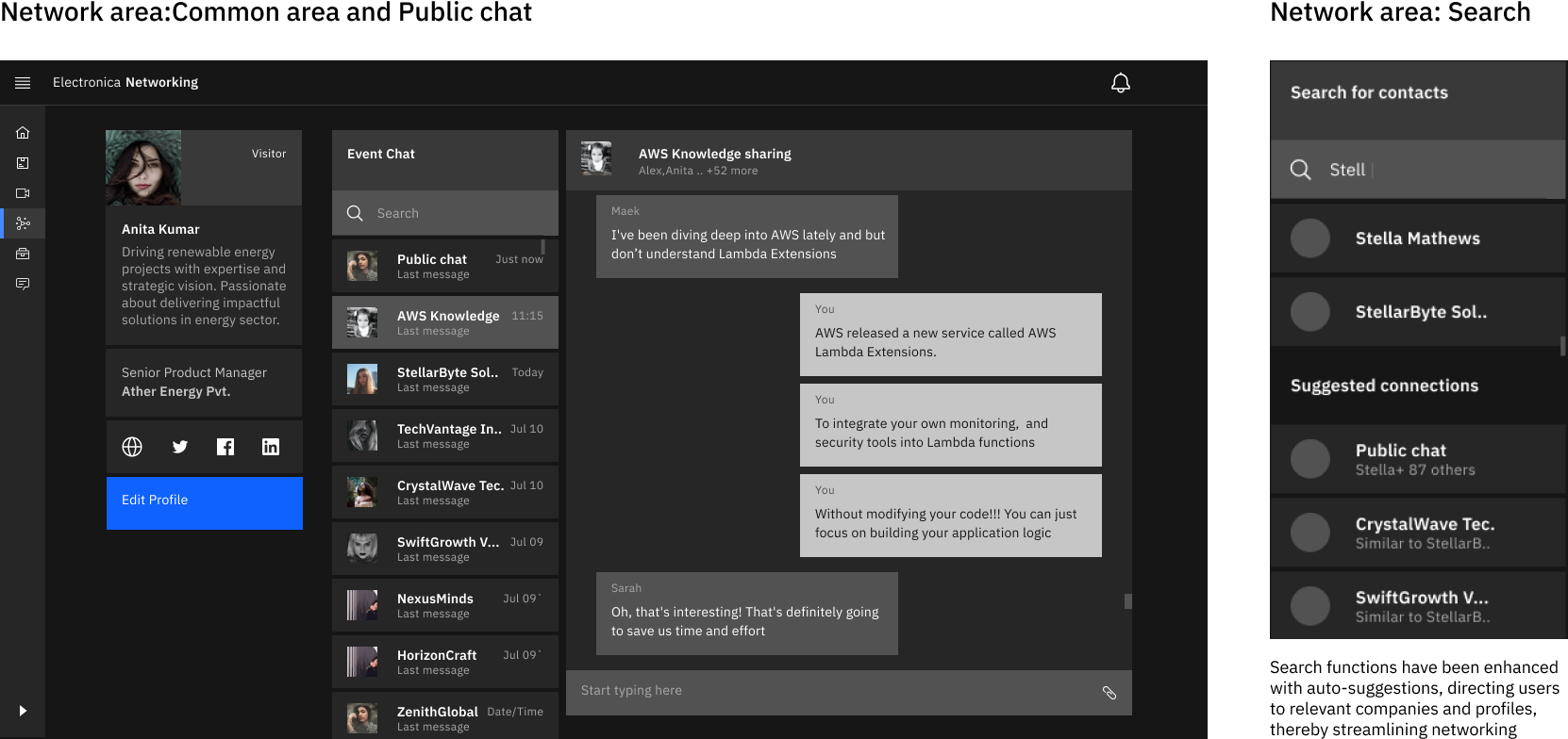
3. Familiar Networking Interface
We aimed to make virtual networking feel less artificial by implementing a familiar chat interface, minimizing the learning curve. Responding directly to user feedback anticipating robust findability, we prioritized enhanced search functionality with auto-suggestions.
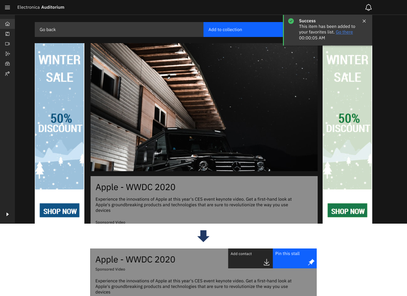
4. Reliable & Accessible Content Viewing (Auditorium)
Addressing common complaints about poor streaming, the Auditorium design focused on stable video delivery using a standard, accessible video player (via Carbon). Subtle refinements, like background blur on video play, were added to enhance focus.
Design Validation & Impact
Within our 8-week sprint, validation relied primarily on qualitative methods:
- Process: We used Figma prototypes for moderated remote walkthroughs, observing users attempting key tasks and gathering think-aloud feedback.
- Outcome: This iterative loop allowed us to catch usability issues early. For instance, observing hesitation directly led to improving the Booth CTAs. While formal metrics weren't captured, consistent positive comments on "ease of use" and "straightforwardness" provided strong confidence that the design addressed core problems effectively and de-risked the initial development.
Value Delivered
The project concluded with delivering a high-fidelity, interactive prototype and design specifications. This provided P&I with:
- A User-Informed Design: Grounded in research and refined through qualitative feedback.
- A Strategic Foundation: A robust blueprint addressing key market weaknesses.
- Reduced Development Risk: Early validation of core flows minimized the risk of building an unusable product.
Reflections
This intense project yielded several key takeaways:
- Qualitative insights are invaluable for understanding the 'why' behind user behavior, especially under constraints.
- Iteration, even small scale, drives quality. Refining designs based on direct observation is highly effective.
- Heuristics and Design Systems provide a strong foundation, accelerating the process and ensuring baseline usability/consistency.
- Clear communication and adaptation are crucial when working within tight timelines and constraints.
What I'd Do Differently:
- Integrate even quicker, leaner feedback loops earlier (wireframe stage).
- Involve engineering more closely from the absolute start to proactively address technical considerations.