Figo: Building Trust First in India's Busy Digital Wallet
Designing a privacy-focused, user-controlled MVP to cut through UPI noise and simplify shared expenses for Indian users. A strategic design exploration.
1. The Challenge: Taming India's UPI Chaos & Earning User Trust
India's Unified Payments Interface (UPI) boom brought convenience but also digital chaos. Users were drowning in micro-transactions, struggling to track spending, split costs fairly, or gain meaningful insights. Generic finance apps often missed the mark culturally and ran headfirst into a wall of deep-seated privacy concerns specific to the Indian market.
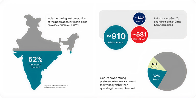
Secondary research highlighted the sheer scale: over half of India's population (~910 million) comprises Millennials or Gen-Z, a demographic larger than that of the US and China combined, with a notable interest in saving and investing. While this confirmed the market potential, the core challenge remained: How could we launch a Figo v1 MVP that solved the *immediate daily pains* of this audience *without* triggering the prevalent privacy alarms, thereby building enough trust for future, more automated features?
Understanding the User: Seeking Control Amidst the Noise
To uncover those specific daily pains, I synthesized insights from primary interviews, surveys, and competitor analysis. Four key struggles emerged:
- The Burden of Tracking: Daily UPI frequency made manual logging feel impossible.
- The "So What?" Data Deficit: Generic charts lacked relevance to personal goals.
- The Complexity of "Sharing": Splitting bills and tracking informal debts was messy and awkward.
- The Pervasive Trust Deficit: High skepticism about granting app permissions, especially bank access (AA).
The synthesized insight was powerful: Users craved effortless control and actionable clarity, delivered through an experience they could fundamentally trust. This understanding directly shaped our core personas:
| Persona | Key Need / Pain Point | How Figo V1 Helps |
|---|---|---|
| Priya (Overwhelmed Pro) | Drowning in micro-transactions; needs speed/ease; tracking is a chore. | Effortless entry (FAB, suggestions), gamification (streaks, points). |
| Raj (Flatmate) | Needs fair, transparent, easy sharing; current methods confusing. | Simplified splitting, dedicated Group Hub with clear balances. |
| Anjali (Planner) | Seeks relevant insights & goal tracking. | Goal linking, progress visualization. (Deeper insights post-V1). |
| Vikram (Skeptic) | Prioritizes privacy/control; wary of permissions (esp. bank access). | Minimal permissions, on-demand requests, visual trust cues, data transparency. |
2. The Strategic Pivot: Why "Trust First" Trumped Automation for V1
While seamless automation via Account Aggregator (AA) was tempting, user research, especially the insights around Vikram (The Skeptic), revealed it was the wrong starting point for an unproven app. Demanding bank linking upfront would be an immediate deal-breaker for many. My analysis showed that building trust was paramount.
Therefore, I advocated for a strategic pivot: embrace manual entry not as a limitation, but as an opportunity to empower users with control and earn their confidence first. This led to the core V1 philosophy:
Build Trust Through Control, Delight Through Experience.
The resulting V1 strategy focused on: delivering an outstanding manual tracking experience, solving the complex sharing problem head-on (a key differentiator), using gamification to combat tracking fatigue, offering flexible input options (OCR, attachments), and clearly communicating AA automation as a future upgrade (Figo Pro) built on earned trust.
3. Designing Figo V1: Key Experiences for Clarity & Control
Guided by the "Trust First" strategy, I designed the V1 interface to be clean, intuitive, and inherently trustworthy, directly addressing the identified user needs through key features:
Effortless Tracking & Engagement
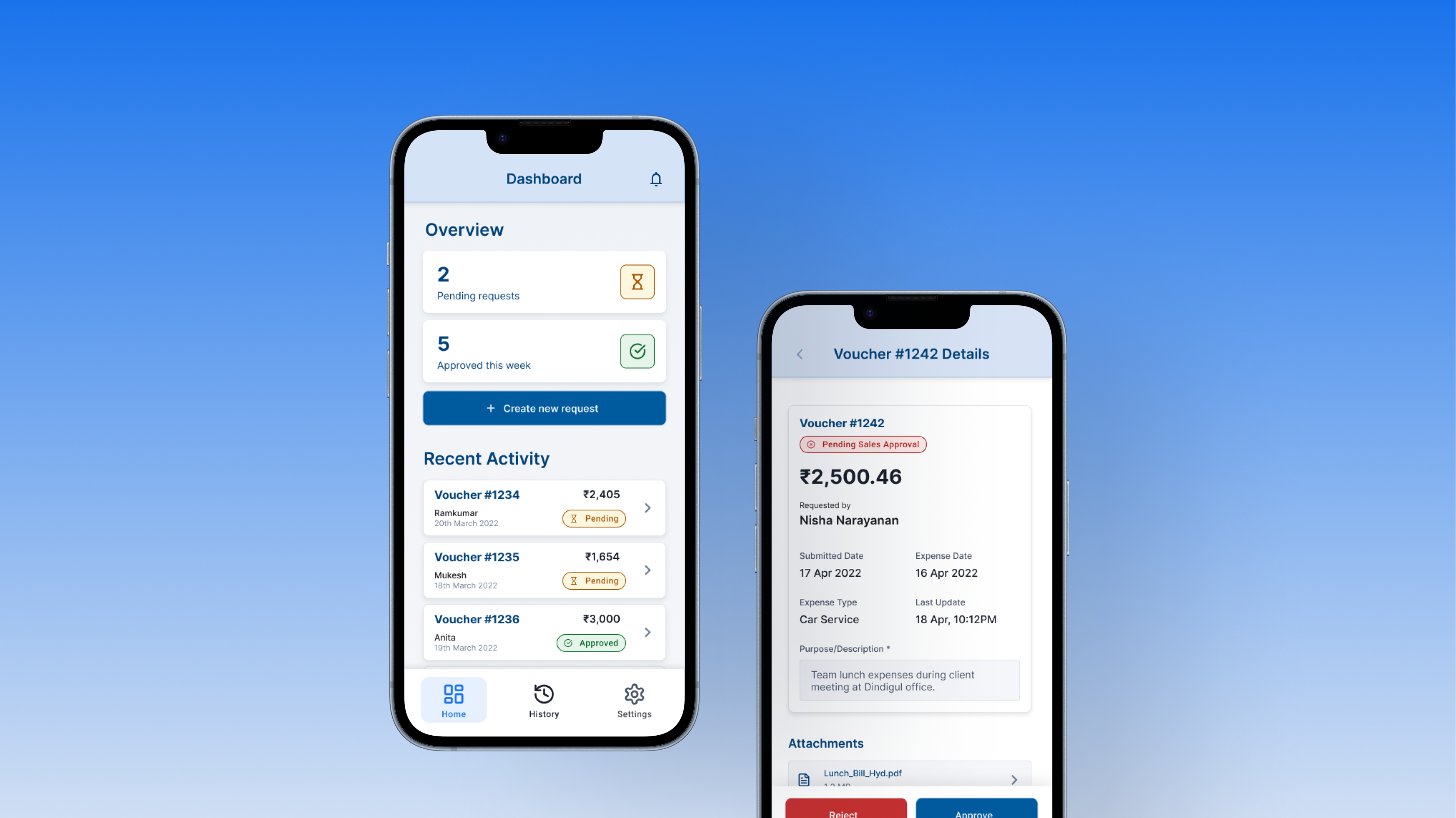
A persistent FAB provides instant access to add expenses. Smart suggestions and large targets minimize friction. A prominent 'Your Progress' card on the Overview uses gamification (streaks, levels, points) to make consistent tracking rewarding, addressing Priya's fatigue.
.png)
Seamless Sharing & Group Management
A simple 'Split this Expense?' toggle leads to an intuitive flow for complex bills. The dedicated 'Groups' tab offers a clear hub for managing shared finances, showing net balances and transaction details easily, solving Raj's main frustration.
.png)
Actionable Clarity & Context
Users can link expenses to savings goals, visualized on the Overview (helping Anjali). The Activity feed provides clear transaction context (split status, payer, share, source tags) for better understanding.
.png)
The V1 Blueprint: A Foundation Built on Trust
The Figo v1 design blueprint directly tackles immediate Indian user pains while respecting privacy concerns. It delivers tangible value through streamlined manual tracking, engaging gamification, and robust sharing features, prioritizing user control and trust over premature automation.
Hypothesized Impact (Conceptual)
We hypothesized this approach could lead to higher tracking consistency (+50%), achieve strong initial retention (>30% M1), and maintain a low onboarding drop-off rate (<5%) due to minimal permission demands.
4. Refining the Blueprint & Charting the Path Forward
Iteration: Honing the Experience Through Feedback
Through scenario-based walkthroughs and heuristic evaluations against our personas, I identified and addressed several key areas for refinement in the V1 blueprint, including simplifying the split flow, enhancing gamification visibility, and optimizing the group view for clarity.
Looking Ahead: Launch, Learn, and Evolve
Figo v1 is the essential first step. The immediate path forward involves development handoff, launch, gathering real-world feedback, continuous iteration, and carefully assessing user comfort to determine the right timing for introducing "Figo Pro" with Account Aggregator integration.